This is something I've been trying out recently, and I thought it might be nice to share it and see if anyone else finds it useful. It's still something of a work-in-progress, but I think the approach outlined below has the potential to speed up workflow and communication within this particular bit of the website design / development process.
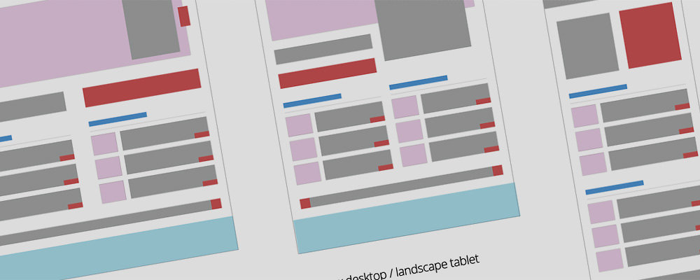
It can be useful to have a simple way to communicate how a web page will be laid out at different screen widths: which bits will grow or shrink, what will sit off the screen, what will be hidden, and so on. This is essentially a diagrammatic approach to the problem of how to communicate that information, as well as a sort of design-aid. It is not a wireframe, as details are deliberately excluded. It is also not a mock-up as the dimensions of objects on the page bear only a loose relation to real life in terms of their relative sizes. It is also fairly useless on its own - it must be read in conjunction with a realistic mock-up of the web page designs in question, depicted at at least one size.
The basic idea is that each website element is represented in a simple block diagram, and colour coded according to broad element types to make it easier for the recipient of the diagram to match these up against a realistic design mock-up. Sizes are only approximate because everything is based on a very large grid to make editing easy.
I think something that makes this approach particularly helpful is its abstraction from reality i.e. the in-built room for manoeuvre that results from not specifying screen widths, and not having exact sizing. There is no particular reason why layout changes have to happen all at once at certain screen widths - after all, break-points are so last week - but it is still important to plan for a good user experience at key screen sizes. How transitions are made, and at what precise screen widths, should probably be dictated by the content in question and doubtless require input from a skilled front-end developer. These diagrams simply show the 'keyframes', if you like.
I have also made a PDF of the same No use as a template, but if you don't have Illustrator at least you can still see what I'm going on about.
I've used these diagrams to plan website behaviour in preparation for front-end build by the quite frankly improbably clever @lnrb0b Perhaps in an ideal world I would mock-up individual page-element behaviour, or sit with my friendly front-end developer and work out how each aspect of the page should reshape itself, but there generally isn't the budget for that. It's still early days, but so far this seems to be quite a good way of roughing out what I'd like to see without adding too many constraints.
Feel free to leave comments below - it would be interesting to know if this is useful to anyone else. And if you think my template is actually about as useful as a brushed-nylon fire-blanket, that I'm completely missing the point, and that I should immediately retrain at my local McDonalds, do please feel free to improve it and re-share!
I hesitated a bit before beginning this blog post for fear that this is actually something that other designers everywhere do all of the time, and I might end up looking like a feckless idiot tapping out egg-sucking instructions for the benefit of no one but the aesthetically deaf. However, as I can't find anyone else talking about this after a full 20 seconds of searching, here goes...
When doing the first visual design for a new website, why not start off in greyscale? That is, design for the final layout and typography, but only using shades of grey.
I first did this quite recently, as a result of inspiration failing to strike in the face of what seemed like the perfect starting point. I'd taken the client through quite a thorough UX analysis and design phase, resulting in a wireframed prototype that seems to be on the money. I had brand guidelines, a good understanding of how the UX requirements should influence the graphic design, and a good feel for what the client and end users would want to see. And yet no matter what I did, I just couldn't seem to get started.
(I don't know if anyone else finds this, but when I'm trying to come up with a new site design, I often find there is a sort of tipping point when the design takes on a life of its own. It's as if the first bit is all uphill, and then suddenly it finds its own direction and you coast down to a completed concept.)
In the end it crossed my mind that the bolder-than-bold corporate colours in the brand guidelines where too distracting, and somehow made 'good' aesthetic decisions harder to make. So I started again with just a greyscale version of the logo in the top left, and began to add the elements specified on the wireframes, but this time only using shades of grey. This seemed to make it easier to focus on the balance of the individual elements on the page, their contrast with each other, and the specifics of the typography. More impact for an individual element might mean a darker grey, or making it bigger, or even a different design. But by not having to worry if I'd picked the right colour from the brand palette I could focus purely on the clarity and balance of the composition.
The outcome was that once I started working this way I very quickly had a completed page mock-up I was happy with, albeit one best suited to hamsters. The next step was obviously to add those missing brand colours, trying out swatches and tints until the colours were talking the same language as the rest of the design.
Unfortunately I can't share the real design work, as the company is big and has put a lot of effort into a rebrand that has yet to launch. But the concept isn't exactly complex, so I doubt anyone needs to see the same design in colour and mono to get the point!
In many ways this is almost a natural progression of the very aesthetically conscientious style of wireframing that I know a lot of UX-ers prefer. I suppose design is like most problem-solving, and if you split one large problem into two smaller ones you have a better chance of getting to the right answer.
So if you find yourself facing a similar problem, and your design is all perspiration and no inspiration, have a go at taking the colour out of the equation - you might be surprised at how much it helps.
Earlier this year I wrote a blog entry for the Auros site about how the UX analysis for a particular project had provided inspiration for the visual design that was to follow. A current project has given me cause to think about this further, and to try to more eloquently explain why I feel that the project stages we generally refer to as 'UX' and 'Design' are in fact just design, and all of the designers involved need to be there for all parts of the process.
At work we recently outsourced the UX component of a particular project, and a few days ago I had a handover from the UX company so that I could start work on the visual design. Usually I handle both bits of the puzzle, and so no kind of handover is required. It made for rather an interesting experience to have been completely separate from the UX analysis and design process, and then receive a set of completed wireframes, approved by the client. I might liken it to starting to watch a movie half an hour in.
What surprised me was how bereft of knowledge I felt. I still understood the client's business, and had a fair idea of what might look good, but all of the subtle nuances of preference that a client normally gives away without even realising were totally absent. I hadn't fully realised until this project just how much of this discretely, subconsciously-delivered information aids my understanding of both what will sit well with the intended users, and what the client will want to see. Without those weeks of to-and-fro with project owners, discussing users and goals and journeys through the site, it felt like I knew both the client and their users less well than I would like to.
It seems rather obvious to say that visual design and user-experience design are simply different stages of the same process, and that really the whole lot is simply DESIGN, and probably would be thought of that way in most industries. But so often I read about them being treated as discrete project elements, handled by different people/teams/companies (delete as appropriate), and that makes me question the way in which many websites are created. The way wireframes describe information and functions on a page has a huge effect on the visual design of a site. The way a graphic designer formats text, images and layouts has a huge effect on a user's experience of a site. So if there is a clear delineation between the two, I don't think I can see it.
And even if we put the influence of visual design on user-experience to one side for a moment; in a commercial setting, the visual designer's judgement call as to what a client will find acceptable can be as important as well-founded user-experience design. The harsh reality is that if you want to get paid, the client has to like your work in the first instance, and not just when or if users report back. And achieving both of those things means knowing your client and knowing what they will like.
I feel like many of the nuances of preference and discrete information that drive delivery of the 'right' design (either from a user-experience or client acceptance point of view), are often implicitly communicated by the client over the course of the UX process. The visual designer / Graphic Designer who is not involved in the design process from the start is missing half the story, and must either do without, or spend time discovering the same things that the UX designer already knows. Likewise without continuity of process from UX analysis through to creation of a visual mock-up or prototype, there can never be a truly thorough realisation of a user-experience designer's vision. Whichever way you look at it, you're wasting time or skills at one end of the process.
Things are looking quite busy over the coming weeks at work, which is great, given how variable the demand for creative design can be from our client base. I find it can be quite helpful, creatively, to have a stack of jobs lined up into the foreseeable future - for some reason it seems to help my mind stay in the mode it needs to be in to draw things worth seeing. Trying to be creative can feel like trying to be lucky, or trying to be well after catching a cold, so anything that helps you remain in that special place is good, as far as I'm concerned.
Thinking about this, and also the fragment I wrote about creative inspiration in an earlier post, got me wondering why inspiration can be so elusive. Douglas Adams once wrote that 'writing is easy: you just stare at a blank piece of paper until drops of blood appear on your forehead'. I often feel similarly about staring at a blank Photoshop file.
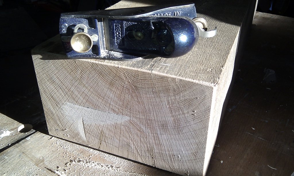
A week ago, I finished preparing a piece of oak for some interior woodwork (a mantlepiece, in fact). It was an oak sleeper from a garden centre, and looked fairly grubby and battered when we got it home. However, a day spent planing the sides revealed the most beautiful, golden-brown woodgrain, and the smoothed and cleaned piece of wood was, if I say so myself, pretty close to perfection. What I noticed was that contemplating this vast, perfectly straight and solid piece of wood was tremendously inspiring. Not in a life-affirming way, I should add. But inspiring in the sense that looking at it made me want to makethings. I don't recall what things exactly, but I definitely wanted to make them, and as soon as possible, and using that lovely bit of wood.
What I'm getting at is that the presence of some tangible raw material is an incredible encouragement tocreate, in the broadest sense of the word. And this in turn causes me to wonder if that may be why getting the ball rolling where virtual creativity is concerned can sometimes be a struggle - no raw materials. Or, at least, no raw materials in the same sense.
Faced with creative choices that are largely limited only by what can be drawn in Photoshop, perhaps one should think of the specific solutions to the requirements of the client, or the end-user, or a usability issue, as the basis for our raw materials. Of course in the end these are still as intangible as the start point (that blank Photoshop file), but they help the designer to visualise the set of solutions that may do the job, and these then become our raw materials, waiting to become something useful, or beautiful, or ideally both. In my head that sounded a lot less pretentious than it came out when I typed it.
Mantlepiece oak beamCreating a smooth end after cutting the beam to length. It took about an hour's work after this point to get it perfectly flat.