Understanding contrast
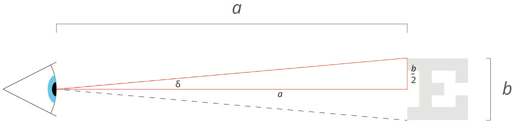
In my last post I talked about what it means to say that text is legible. If you haven't read it, you might want to take a look before you dive into this one, as some of the maths follows on.
It's pretty obvious that contrast can and does have a significant impact on legibility, and therefore also readability, and not enough of it can make for an unpleasant user experience. To counter this problem there are strict guidelines set out by W3C. If you work in web-based media you'll be familiar with the Web Content Accessibility Guidelines (WCAG), which define minimum contrast values for text in both AA and AAA accessibility standards. WCAG 2.0 level AA requires a minimum contrast ratio of 4.5:1 for normal text and 3:1 for large text. Level AAA requires a contrast ratio of at least 7:1 for normal text and 4.5:1 for large text. And the guidelines also state that once contrast reaches 7:1, legibility is unaffected beyond this point. And if that all seems a bit impenetrable, there are many online contrast checking tools available that allow you to test your proposed text foreground and background colours to see if they meet the guidelines.
What is contrast?
In simple terms, contrast in vision is the ability of the eye to distinguish between differing colour and brightness. The values listed above are the ratio of the 'luminance' between the foreground and background colours (though not necessarily in that order). You can think of luminance in this context as a measure of the intensity of light as perceived by the human eye. Some wavelengths (i.e. colours) of light have more luminance than others, peaking in the green-yellow part of the spectrum.
The process by which contrast ratios are calculated probably isn't for the mathematically faint-hearted, but I'll set it out anyway. Feel free to skip to the next heading if it all looks like Greek to you. It probably is.
The first step is to work out the relative luminance of the foreground and background colours in question. To do that we use these formulas:
if RsRGB <= 0.03928 then R = RsRGB / 12.92 else R = ((RsRGB + 0.055) / 1.055)2.4
if GsRGB <= 0.03928 then G = GsRGB / 12.92 else G = ((GsRGB + 0.055) / 1.055)2.4
if BsRGB <= 0.03928 then B = BsRGB / 12.92 else B = ((BsRGB + 0.055) / 1.055)2.4
...where...
RsRGB = R8bit / 255
GsRGB = G8bit / 255
BsRGB = B8bit / 255
You can think of the SRGB values as proportions of red, green and blue. Thus, if your text colour was specified as #800000, that's a red value of 80 in hex, or 128 as a decimal, so the SRGB value for red would be 128/255 = 0.5.
We can now calculate luminance by combining the R, G and B values above in the following way:
L = (0.2126 x R) + (0.7152 x G) + (0.0722 x B)
Note that to acquire a luminance value we are essentially adding up the red, green and blue values, adjusted by constants in accordance with how much of an impact those wavelengths of light have on luminance. Thus the green value has a far bigger impact on the final luminance value than the blue value.
Finally, having calculated L for both the foreground (text) colour and the background colour, we can work out the contrast ratio between the two quite simply, as follows:
Contrast ratio = (L1 + 0.05) / (L2 + 0.05)
Where L1 is the most luminous and L2 the least luminous of the two colours.
OK, so that's the scary maths-bit over...
So why am I interested in this? Well, at present if we designers want our websites to be AA or AAA compliant, they must meet with the contrast guidelines described above. But in real life, of course things are rarely as simple as a binary rule: "THIS text is legible, THAT text isn't..."
Text on the web that is illegible or at least hard-to-read due to the choice of colours is nothing new. Katie Sherwin, writing on the Nielsen-Norman Group blog, has some interesting things to say about the use of low-contrast text on the web.
What I'm suggesting here is that it is possible to have hard-to-read text that meets the WCAG rules, and easy-to-read text that doesn't. For example...
As far as I can tell, this text passes the AA level guidelines, with a contrast ratio of about 4.5:1.... The question is, is it easy to read? I suspect that most people would find this paragraph harder to read than the next one. I'm deliberately droning on and on here, just to make sure there is a nice long block of text to really ram home the point I'm trying to make. Fortunately for you, the next box just says...
bicycle.
So, in case it wasn't already clear, the top box should pass AA guidelines, but the text in the bottom box fails both AA and AAA.
Now, to be clear, this isn't due to lack of care on the part of the clever people who make up the WCAG. In fact the guidelines go to some lengths to explain the choice of contrast-ratios used as cut-off points, and they are clearly the result of considerable thought and research. My point is really that, as soon as you introduce any sort of binary rule into design, it immediately creates space for applications of that rule that seem outside of what was intended, such as the text above.
Now, designers clearly can't user-test each piece of text we want to use to see if it the contrast works well enough, and a hard-and-fast rule is a pretty safe alternative. But what if, instead, we try to look at the effect contrast has on legibility, and apply it on a case-by-case basis to mathematically assess how legible and how readable a piece of text will be, across devices. Can we construct a formula that would warn you that the red box above might be hard to read, but reassure you that the text below it is likely to be just fine?
Modelling contrast
We know that contrast effects legibility. Therefore it is logical to suggest that, in most cases, a reduction in contrast can be countered with an increase in text size. Consider the text you are reading right now:
If I suddenly make it slightly lighter, it becomes harder to read, right?
But if also make it bigger, it's not so much of a problem.
Now imagine a graph where we plot the size a character needs to be to maintain it's level of legibility against its contrast with its background. Thinking about how this model might look, we can see we already have two known points on the graph.
Firstly, according to WCAG, once contrast reaches 1:7 there is no further improvement in legibility. We express 1:7 as 1 divided by 7, or 0.143, so this gives us the start of our graph. To the left of this point (i.e. where contrast is better) it should level out.
Secondly, we might reasonably say that if the size of text has to increase each time contrast decreases, then the other end of the graph must tend towards infinity. To put it another way, once contrast has a ratio of 1:1 (for instance white on white or black on black), the text would have to be infinitely large i.e. it can never be legible at that contrast ratio.
In between I will assume (for want of information to the contrary) that the relationship is a smooth curve. Thinking about these few characteristics, we end up with a graph that looks a bit like this:
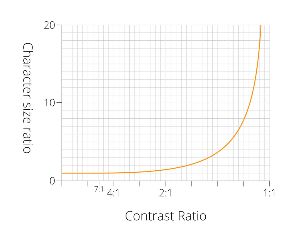
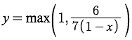
The next logical step is to try and find a mathematical function that will produce a curve that looks like this, so that we can predict the necessary change in text height for any given contrast ratio. To me, that looks a little like a 1 / 1-x function, though if anyone reading is a proper mathematician (or knows one), I would welcome any alternative suggestions. The best-guess function I have at present is...
Putting it into practice
Having come up with a function that might model the effects of contrast on legibility, it seems sensible to try it out. I have created a sort of legibility testing tool to do this. Feel free to try it out and have a play, although be aware that it is all rather Beta, and probably as likely to break as to work. The font detection relies on Flash, and also won't work if you're using any sort of 'private browsing' mode. It also takes a few seconds to work, so have patience.
Stupidly, I borrowed the font-detection AND the nifty size-calculation scripts from somewhere, and can't remember where. If they're yours please let me know so I can give credit where it's due!
What is it all for?
This tool is designed to combine all of the legibility-related calculations from this blog post and the previous one, and allow a designer to choose any locally-installed font, specify the size, colours, and intended device on which it will be displayed, and see just how legible it might be.
The point of all this is twofold:
- To enable designers to make better decisions about typography, for a more readable web experience.
- To free designers from the constraints of hard-and-fast contrast rules, so that where branding or aesthetics require type to appear outside of the suggested cut-off points, a judgement call can be made with confidence.
Next steps
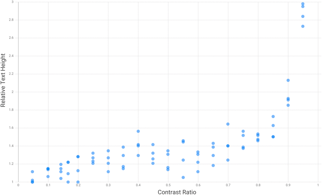
The plan is to test the theory. I've written some testing software that should enable me to test real eyeballs under controlled conditions, and see if the relationship between text size and contrast really does look like this. It may be a little while before a large-scale test can happen (though with help from my awesome colleagues at Zone it shouldn't be too long, I hope), but early signs are good. Here is a chart of results from testing myself and a couple of others in not-very-controlled conditions...
If you found this useful or interesting, or if you know anything about this topic and you don't mind sharing, please add a comment below. Thanks for reading.
References and Links
WebAIM: Color Contrast Checker
Wikipedia entry: Luminosity function
Conference Paper: Human Computer Interaction, Legibility and Contrast
!['Snellen chart' by Jeff Dahl - Own work by uploader, Based on the public domain document: [1]. Licensed under CC BY-SA 3.0 via Wikimedia Commons](http://upload.wikimedia.org/wikipedia/commons/thumb/9/9f/Snellen_chart.svg/640px-Snellen_chart.svg.png)


