Redesigning National Rail Tickets
Could UK train tickets be redesigned to be more usable without changing how they are printed? Could National Rail use their existing technology to deliver a better user experience, and even save money on printing costs in the process?
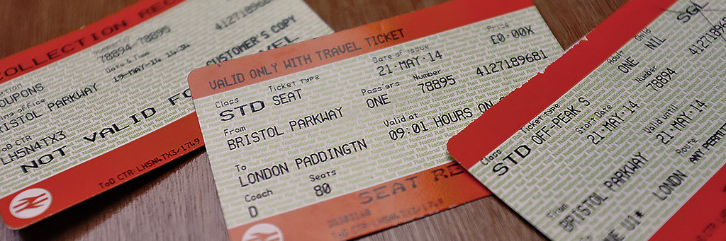
I've probably used the train more times in the past six months than in the previous 6 years combined. A frequent source of irritation is the poor design of the handful of credit-card sized tickets issued forth by the self-service machine every time I travel. They seem almost intentionally difficult to use in a hurry.
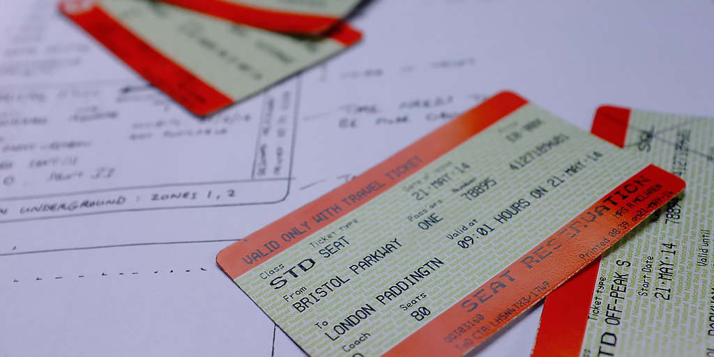
With matching collection receipts, a simple return journey can often result in sextuplets of orange-and-green tickety nonsense. All six look very similar, and so tend to be similarly hard to extract key information from, not to mention difficult to tell apart.
Every time I accidentally feed a seat reservation into the ticket barrier, I feel certain that these bits of card could be much better designed.
Restrictions and limitations
I like the idea of a solution that works within the existing infrastructure. There are about 1000 stations with self-service machines in the UK, and if we conservatively estimate an average of just two machines per station, clearly changing them would be quite expensive. So a realistic solution should be deliverable from the same infrastructure. In practical terms this means retaining the following characteristics:
- Credit-card size
- Low-resolution printing
- Black ink only
- Single-sided printing
- Maintain the existing 'safe' print area
Which ticket?
There are many variations of the existing ticket format, encompassing such things as multi-part journeys, and multiple seat reservations for large groups. It's obviously not easy to see examples of all types, but what is clear is that trying to design to fit all possible variations on a single ticket is a route to something just as cramped and indecipherable as the existing solution. Instead, I'd rather look at the simplest solution possible for a common journey type - a return journey - with the goal that it could be extensible for more complex journeys.
Information overload
I'm also going to assume that the information printed on the tickets all has some importance, and concentrate on eliminating duplication rather than trying to second-guess what might be needed. Here is a list of the information on my own tickets, reservation, and receipt.
| Ticket | Seat reservation | Receipt |
|---|---|---|
| Type of ticket | Type of ticket | Description |
| Number of passengers | Number of passengers | Coupon numbers |
| Class of ticket | Class of ticket | Price |
| Start date | Valid date & time | Issuing office |
| End date | Item number | Date & time |
| Item number | Price | Item number |
| Price | From / To | Code |
| From / To | Code number | Date printed |
| Route | Purchaser name | |
| Validity | Date printed | |
| Code number | Coach | |
| Purchaser name | Seats | |
| Date printed | ||
| Underground validity |
The Seat Reservation contains very little unique information - just the coach and seat number in fact. And the collection receipt seems mainly to exist to tell you how many cards you should have picked up from the machine. So if the ticket and reservation could fit onto one card, we could dispense with the receipt too.
Single or return?
The other thing I've noticed is that, due to the peculiarities of a rail service where it is often cheaper to buy two singles than one return ticket, I'm often collecting twice the number of cards I really need. It's obviously important to an effective design process to consider the overall system in which something has to work. In this instance, it seems prudent to ask: why can't two single tickets that are intended to make up a return journey be printed out as such? It seems like an obvious and simple improvement to make.
Reframing the problem
What would we really like to achieve, within the constraints described above?
- A ticket that is easier to read
- A ticket that is easier to use
- A unique benefit to the new design, over and above the previous two goals.
How might this be achieved? Well, we can obviously make the ticket easier to read with a clearer font and a minimum font size that improves legibility. Basic legibility for a reader with 20/20 vision is often quoted to exist if the height of letterforms subtend at least 5 minutes of arc (that's five sixtieths of a degree) to the eye. Likewise text is generally considered 'easy to read' when the height of the letterforms subtends at least 16 minutes of arc. If we assume most people are comfortable reading printed text at a distance of 40cm, this means we need a minimum letter height of at least 1.9mm. This would be the height of any character if the text is in CAPS, or the x-height of the font otherwise.
To further ensure that the information on the ticket is as easy to read as possible, I'm going to set it in Tiresais Infofont, a typeface created by the RNIB and intended (amongst other things) to be easier to read for the partially sighted. Whilst it might not be the prettiest font around, the uniformly thick lines should work well with the existing print set-up, and still be legible at small sizes and low resolution.
One huge failing of the current design is its reliance on words. Surely it is worth considering the number of foreign visitors who use the train in the UK? Could the tickets be redesigned to communicate basic journey information in a way that can be understood with only the most basic understanding of English?
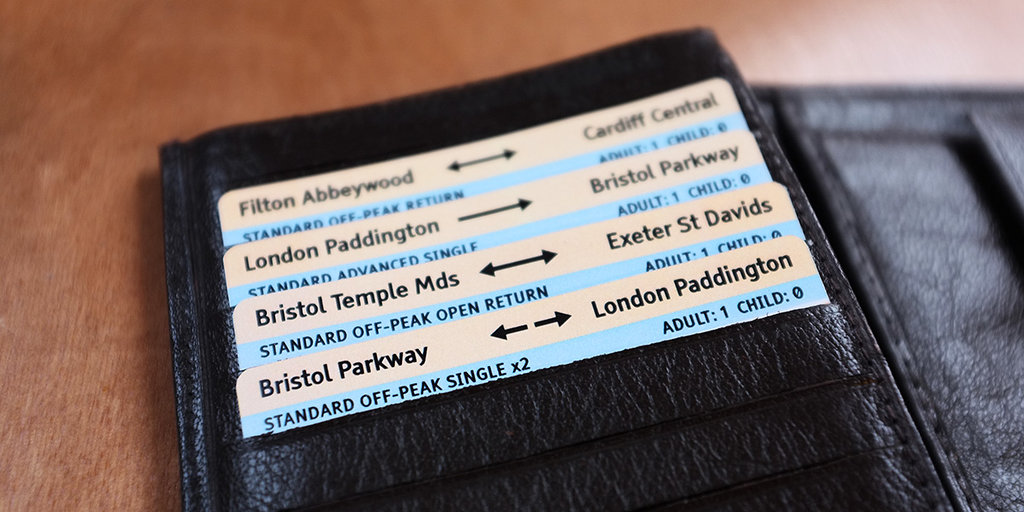
Finally, it is clear from the current tickets that printing close to the edge is possible. So why not take advantage of the credit-card size, and allow people to store their tickets in their wallet whilst keeping some key information visible?
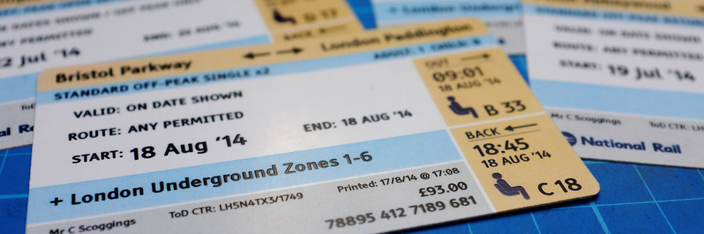
The redesign
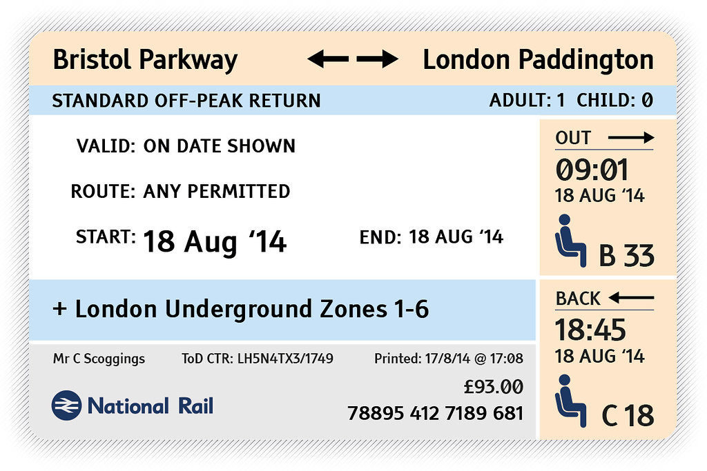
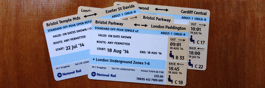
Key features include...
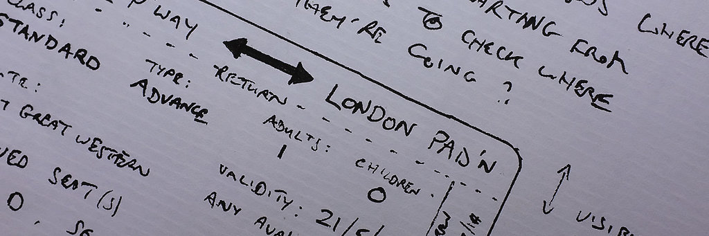
- The top of the ticket now shows the origin and destination: a single arrow would indicate a one-way journey, a double arrow a return, and a broken double arrow (as above) would mean two singles that combine to make a return journey. This is intended to be easy to check at a glance, and also comprehensible independent of language.
- The right edge of the ticket shows seat reservations and train times and dates. Note that icons have been used to make this function clear without relying on language.
- The two blue portions show the type of ticket and any extra validity (in this case London Underground).
- The white portion is concerned entirely with validity (when, where, which trains etc),
- The grey area at the bottom holds all of the necessary 'admin' details, such as price and date printed.
- All crucial text has a minimum character height of 1.9mm. Only the recipient name, code and print date are smaller than this, on the assumption that these are rarely used.
And here is that USP - with the ticket stored safely in your wallet, the origin and destination are still visible. The existing tickets are somewhat mysterious when stored the same way, and it seems a shame not to make some use of the part that is still visible.
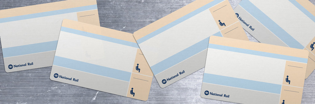
Finally, the ticket blanks would look like this:
If you've had the stamina to read this far, well done you! If you have any comments or suggestions (maybe you find UK train tickets hard to use, maybe you think my redesign actually makes them worse...) I'd love to hear them. The comment box awaits your wisdom!