Design by homeopathy doesn't work
There is a problem that I think most designers encounter at some time or another, and I have unilaterally decided to call it Design by Homeopathy. You deliver a strong design - something memorable, hopefully, and with a bit of character. You take this design and give it to a client, who wants to dilute it with a large quantity of blandness. Maybe there are some overall guiding requirements from higher up in the organisation, or requirements from internal stakeholders, but your exciting design is getting seriously watered down. But you bite the bullet and mix in the blandness, and take the result and give to the client again. Again it gets diluted with more blandness. This can happen any number of times, but that's OK, because the blandness 'remembers' the initial great design.
Oh, no, hang on. No. No it doesn't. Design by Homeopathy doesn't work.
Now I'm aware that this sounds (not entirely inaccurately) like the ranting of a stuck-up designer who just knows best, OK? And you may be right, but there is an alternative...
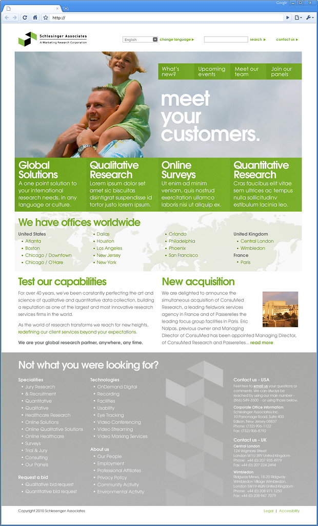
I recently had one of my favourite new site designs finally go live, and I'm as pleased with it now as I was when I first handed over the Photoshop files to be built. The site is Schlesinger Associates, and the way we came to win the work is quite unexpected.
Auros (my employer) won the work to build their new site on the basis that we'd be handling the technical side of things whilst their usual branding / marketing partner handled the design side of things. However, the design part just didn't seem to be working. It's not clear what went wrong, but my guess would be that the contractor concerned was perhaps not too 'web-savvy', and the client wasn't sure what they wanted. The result was that each small request from the client seemed to have been actioned on the design, but without a 'guiding hand', and so the end-product was unfocussed to say the least. And this isn't meant in a derogatory or deprecating way. What happened is quite common, in my experience. Without a will to have a focussed and purposeful site, a contractor attempting to get a design signed off for a client that is having difficulty expressing what they want in a general sense can end up in knots trying to appease detail changes when the bigger picture has been missed. No finger-pointing: it just happens.
In the end, we decided it was worth risking offending the client for the sake of a better end-result. We did a brief study of who was using the site and what for, worked out how the navigation and content could be best structured, knocked out a clean-sheet design in a spare afternoon. It was fairly off-the-cuff, and mainly intended as a way of showing our genuine concern for where the design was headed, rather than as a serious play to get the work. The run up to our scheduled transatlantic phonecall with the client was pretty tense, and we didn't want to risk the client thinking that we were wasting their time or trying to muddy the waters.
What transpired however was a moment of clarity. They seemed genuinely interested by our comments, and by the design too. The result was that we were now to be entrusted with the design work - big smiles all round!
We embarked on a formal design process. This involved preparing another three concepts, all different, each presenting a different side to the company's personality. What was deeply satisfying about this was the collective response of Schlesinger Associates to this process. They were constructive, interested, and open to advice about the direction they should take. Intriguingly, after all was said and done, the final design chosen was a minor variation of the very first concept we showed to them. But that is by the by: woo, we got it right first time, pats on the back all round, etc.
I really don't want to turn this into any sort of trumpet-blowing exercise, but this aptly demonstrates the value of having a story, of giving a site a guiding purpose, and of sticking to those principles come what may. And why? Because if you're lucky you'll get a client that responds to that. Strong corporate design is often the result of people taking a risk - blandness, design that can never offend or otherwise move anyone, is the easy path. The Schlesinger design didn't end up looking good because we're amazing at Auros (alright, so we're abitamazing). It ended up looking good because the person paying the bills didn't want it diluted.
They wanted a statement, that's what they got,and I think most people would agree that it says only good things about them.